Our series on hand drawing continues with Kevin Laferriere:
Design can be a messy business. Matters of construction, comfort, climate, economy, emotion, and beauty all vie for precedence as a project progresses. An architectural project is essentially a bridge on which these opposing forces will inevitably collide. A work of architecture ends up being the embodiment of a holistic solution. Such a solution requires a holistic approach. Sketching by hand fits this bill quite nicely.
I speak for myself when I say this, but I imagine that I am not alone: I have a hard time keeping loads of information organized in my head at once. I often resort to writing things down. A funny thing happens when I do this, though. The abstract pieces of information and data, buzzing aimlessly around in my mind, now have a physical place to rest. Information, in a way, becomes a collection of physical objects laid in front of me. Now my mind, unburdened with the task of holding the information, can look at the problem in a new way.
Sketching allows a designer to do the exact same thing. By representing thoughts and ideas on a physical page, the mind and body enter a dialogue, each informing the other on how to proceed. Many times, though, a sketch is begun with only a vague idea of the end result. As the mind guides the hand in the act of drawing, the physical drawing reveals what thoughts look like in real life. In the same way that a random road sign can remind you of the song title you and your friends were racking your brains to remember. Stray, seemingly insignificant, lines can create connections between previously unrelated elements.
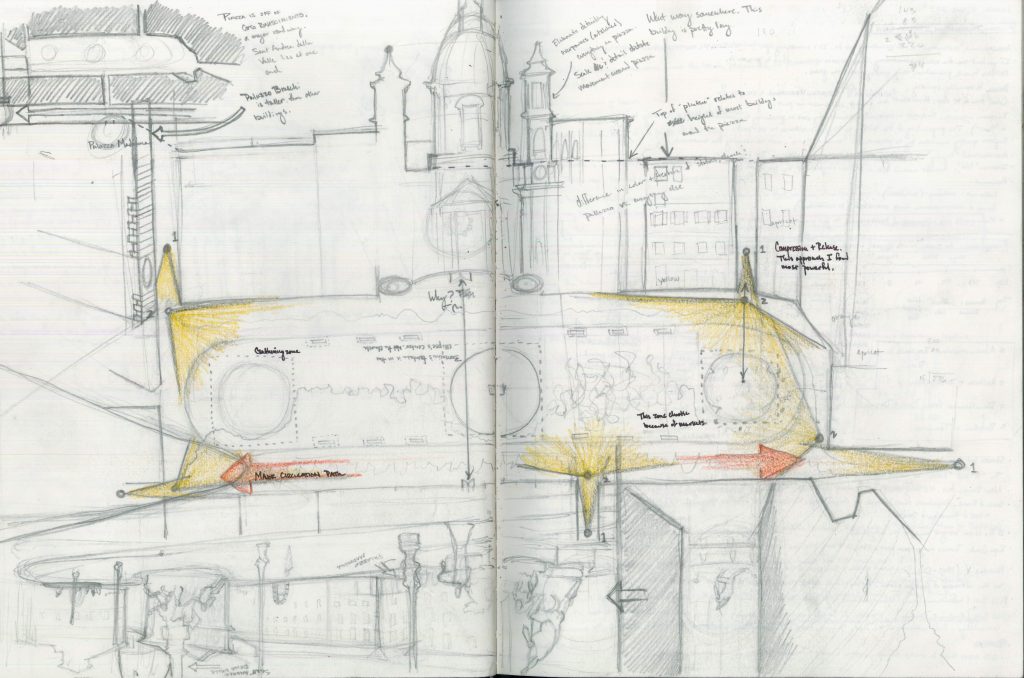
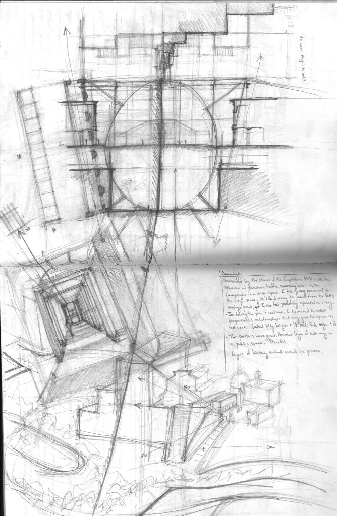
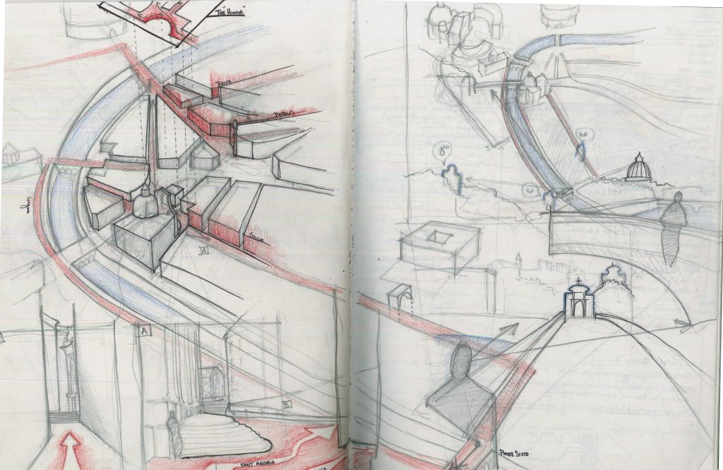
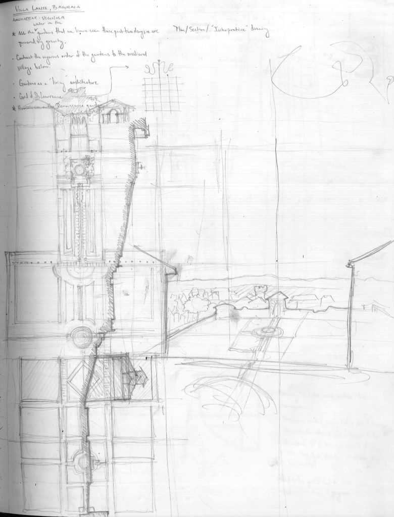
When thinking about this topic, I can’t help but be reminded of my time spent studying in Rome. As countless other architecture students before us, my classmates and I spent a semester studying and sketching some of the history’s most influential works of architecture and urban design. Looking back on the sketches made over those few months, the ones that I cherish the most are often the messiest. My professor that semester, Scott Finn, to whom the adage “practice what you preach” perfectly applies, fills his own sketchbook with beautiful analytical drawings. A floor plan, a building elevation, a cross section, and a perspective rendering all coexist on the same page, often being laid one on top of the other. While the method seemed odd at first, I quickly learned the power in such technique. By taking different “views” of a design problem and layering them, one begins to see relationships between elements that can only be seen in this way.
This taught me that sketches aren’t a production of an intended result; they are a record of the mental process. A sketch is not simply a product of the mind. A sketch is an extension of it.
Below are some of my favorite sketches from my time abroad. You will notice that they aren’t the prettiest things, but hopefully you see thoughts and ideas being worked out. You don’t have to be a gifted artist to reap the benefits of thinking visually on paper!

Plan Analysis of Piazza Navona

Campidoglio

Via Guila

Villa Lante (Bagnaia)
Faithfully,
Kevin Laferriere
All Content on this Site is the Property of McALPINE
Copyright © 2025 McALPINE
All Rights Reserved Worldwide.

Entertaining and inspiring. Wonderful.
So very well done! Thank you for sharing!!
Hi. I am blown away with McAlpine’s love for hand sketching and drawing. I love to sketch and illustrate beautiful spaces and architecture as well.
Thanks for sharing!!
Em.